The Ultimate Guide to Spot Colors for DTF Printing
If you’ve ever heard the term “spot colors” thrown around in the printing world and nodded along without fully grasping what it means—or why it matters—this guide is for you. Whether you’re a designer stepping up to professional-grade tools like Adobe Illustrator or CorelDRAW, or a business owner aiming to deliver consistent, jaw-dropping results for your clients, understanding spot colors is a game-changer. In the realm of Direct-to-Film (DTF) printing, spot colors aren’t just a buzzword—they’re your ticket to nailing precise color matches every single time.
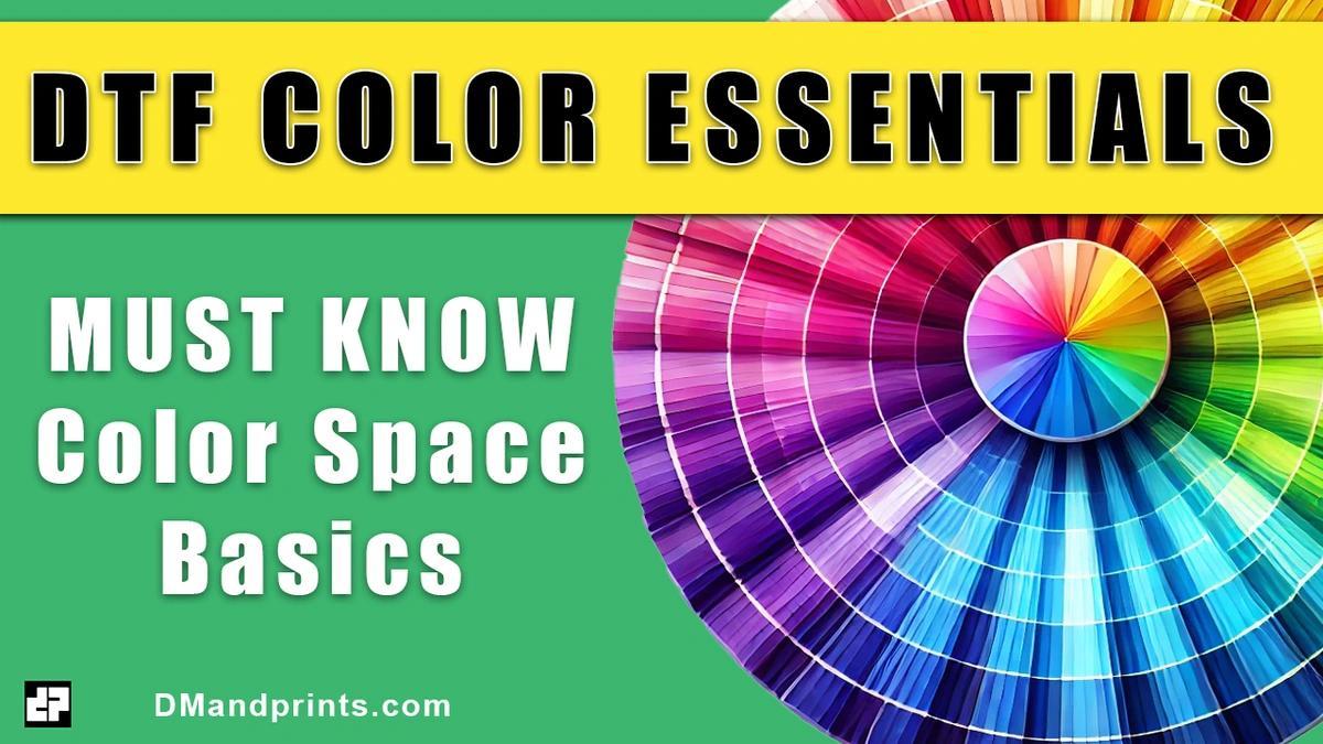
The Ultimate Guide to Spot Colors for DTF Printing: Precision, Consistency, and Professional Results
If you’ve ever heard the term “spot colors” thrown around in the printing world and nodded along without fully grasping what it means—or why it matters—this guide is for you. Whether you’re a designer stepping up to professional-grade tools like Adobe Illustrator or CorelDRAW, or a business owner aiming to deliver consistent, jaw-dropping results for your clients, understanding spot colors is a game-changer. In the realm of Direct-to-Film (DTF) printing, spot colors aren’t just a buzzword—they’re your ticket to nailing precise color matches every single time.
This article will walk you through everything you need to know about spot colors: what they are, why they matter for DTF prints, how to use them effectively, and how they empower your print partner (like DMandprints) to deliver sub-1 Delta E color accuracy with ease. We’ll start with the basics, build to advanced techniques, and give you the confidence to wield spot colors like a pro. Let’s dive in.
Why Should You Care About Spot Colors for DTF Printing?
Imagine this: You’ve designed a vibrant logo for a client. It’s got a signature red that screams their brand identity. You send it off to your DTF printer, expecting that exact red to pop off the fabric. But when the sample arrives, it’s… off. Maybe it’s too orange, too muted, or just not right. Frustrating, right? This is where spot colors come in.
In DTF printing, where designs are transferred onto film and then heat-pressed onto garments, color accuracy is everything. Unlike traditional CMYK printing, which mixes cyan, magenta, yellow, and black to approximate colors (sometimes with hit-or-miss results), spot colors let you define exactly what you want. They’re your insurance policy against color drift, ensuring that your printer can replicate your vision—whether it’s the tenth shirt or the thousandth.
But it’s not just about accuracy. Spot colors also streamline your workflow. By naming and saving them, you create a reusable color library that you—and your print partner—can reference forever. For businesses scaling up, this consistency is gold. Your clients will notice, and your reputation will soar.
What Are Spot Colors, Anyway?
Let’s break it down as if you’re opening Illustrator or CorelDRAW for the first time. A spot color is a single, premixed ink color that’s applied directly during printing, rather than being built from a combination of other inks (like CMYK). Think of it as a custom paint can you hand to your printer, labeled with a specific name or code, saying, “Use this.”
In the design world, spot colors are often tied to standardized systems like Pantone. For example, Pantone 186 C is a bold, unmistakable red. When you assign that spot color to your design, you’re telling your printer, “I want this red, not some close-enough guess.” It’s precise, repeatable, and universal.
[Insert screenshot of the Illustrator Color Swatches panel here, highlighting a Pantone spot color like 186 C.]
But spot colors aren’t limited to Pantone’s library. You can create your own custom spot colors in your design software, give them a name (like “ClientX_BrandBlue”), and use them to signal specific hues to your printer. This flexibility is what makes them so powerful for DTF.
A Quick Nod to Tradition: Spot Colors in Screen Printing
To understand spot colors fully, it’s worth a quick look at their roots in old-school screen printing. Back in the day, printers used spot colors to create separations—individual screens for each color in a design. If a logo had three colors (say, red, black, and yellow), they’d mix a batch of red ink, a batch of black, and a batch of yellow, then print each one separately. The result? Crisp, vibrant designs with no muddy overlaps.
[Add a 1-minute video here showing a basic screen printing separation process with spot colors.]
In DTF, the process is different—colors are printed onto a film in one pass using inkjet technology—but the spirit of spot colors lives on. Instead of physical separations, you’re using spot colors in your digital file to communicate intent. It’s less about the mechanics of printing and more about locking in that perfect match.
Why You Need to Understand Spot Colors for DTF
In DTF printing, spot colors bridge the gap between your creative vision and the final product. Here’s why they’re non-negotiable:
- Precision: DTF printers use CMYK inks, but spot colors let you specify an exact target (often converted via RIP software) that overrides the printer’s guesswork.
- Consistency: Naming a spot color means you can reuse it across projects, ensuring every batch matches the last.
- Professionalism: Submitting files with spot colors signals to your printer that you’re serious—and it helps them deliver serious results.
Without this understanding, you’re leaving too much to chance. And in a competitive market, “close enough” doesn’t cut it.
Tools You’ll Need to Master Spot Colors
You don’t need a PhD in design to use spot colors—just the right tools and a little know-how. Here’s what you’ll need:
- Design Software: Adobe Illustrator or CorelDRAW are industry standards. Both support spot color creation and Pantone libraries.
- Pantone Reference (Optional): A physical Pantone swatch book or digital library helps you pick standardized colors.
- A Savvy Print Partner: Companies like DMandprints can interpret spot colors in your exported AI or PDF files and match them precisely.
[Insert screenshot of the CorelDRAW Color Palette here, showing how to access Pantone libraries.]
The Simple Use Case: Picking a Pantone Spot Color
Let’s start with the basics. Say you’re designing a T-shirt for a client whose brand uses Pantone Reflex Blue C—a rich, deep blue. Here’s how you’d set it up:
- Open Illustrator or CorelDRAW.
- Go to the Swatches panel and select “Open Swatch Library” > “Color Books” > “Pantone+ Solid Coated.”
- Find Reflex Blue C, add it to your swatches, and apply it to your design.
- Export your file as a PDF or AI, ensuring spot colors are preserved.
When you send that file to DMandprints, we see “Reflex Blue C” and know exactly what to target. Our RIP software converts it to the closest DTF ink mix, and boom—your blue is spot-on.
[Add a 1-minute video here demonstrating how to select and apply a Pantone spot color in Illustrator.]
The Advanced Use Case: Custom Spot Colors for Color Matching
Now, let’s level up. Maybe your client’s brand color isn’t in the Pantone library—it’s a unique teal they’ve used for years. Here’s where custom spot colors shine:
- In your design software, create a new swatch.
- Use the color picker or input specific values (e.g., RGB or CMYK) to match the teal.
- Name it something meaningful, like “ClientY_SignatureTeal,” and mark it as a spot color.
- Save it to your swatches library for reuse.
When you send this file to DMandprints, we don’t just see a random teal—we see “ClientY_SignatureTeal.” We can log that into our color book, test it against your sample, and refine it until it’s a sub-1 Delta E match (that’s geek-speak for “visually indistinguishable from the original”). Next time you order, we pull up that exact formula. No guesswork, no drift.
[Insert screenshot here of creating a custom spot color in CorelDRAW, with the naming dialog open.]
How Spot Colors Help Your Print Partner Help You
Here’s the magic: Spot colors aren’t just for you—they’re a lifeline for your printer. When you embed them in your AI or PDF files, you’re giving us a clear roadmap. At DMandprints, we recognize those spot colors as a signal of intent. We can:
- Catalog Your Colors: Add “ClientY_SignatureTeal” to our system for instant recall.
- Hit Tight Tolerances: Achieve sub-1 Delta E accuracy, batch after batch.
- Scale with You: Support your business as it grows, from small runs to mass production.
This isn’t just printing—it’s partnership. Spot colors tell us you’re playing at a professional level, and we’ll meet you there with pro-grade results.
Putting It All Together: Your Spot Color Workflow
Ready to make spot colors your secret weapon? Here’s a step-by-step workflow:
- Define Your Colors: Use Pantone for standards or create custom spot colors for unique hues.
- Name Them Smartly: “BrandX_Red” beats “Red1” every time.
- Test and Tweak: Send a sample file to your printer and review the proof.
- Save and Reuse: Build a library in your software and trust your printer to store the matches.
- Scale Confidently: Know that every order will look as good as the last.
[Add a 1-minute video here showing the full workflow from picking a spot color to exporting the file.]
The Bottom Line: Spot Colors Are Your DTF Superpower
Spot colors aren’t just a technical detail—they’re a mindset. They give you control, consistency, and the ability to deliver for your clients like never before. Whether you’re leaning on Pantone’s precision or crafting custom hues with names that stick, you’re setting yourself—and your print partner—up for success.
At DMandprints, we’re obsessed with nailing your colors. Send us a file with spot colors, and we’ll treat it like the professional blueprint it is. From hobbyists stepping up their game to brands demanding perfection, this guide is your go-to resource. Bookmark it, revisit it, and let’s make every print a masterpiece.